Organic Traffic
What does organic traffic mean? Organic means naturally occurring. In this instance, organic traffic means visitors and views that happen naturally, without a paid advertisement.
Why is organic traffic important?
Organic traffic is free traffic. Do you have an ad budget for the next year mapped out? Can you spend a minimum of $5 per day? If the answer to that is no, then organic traffic is especially important to you. Organic traffic means visitors to your site without spending money to get them there.
At Off-Center Design, our goal is to create a website with a design that draws people in, keeps them engaged, and encourages them to browse the site—naturally. So, we help our customers make the most out of every single visit. We design to encourage users to stick around.
Why do we want them to spend time browsing?
Because the longer a potential customer is on your site, the better chance you have of making a connection with that person. If you make the connection, then you can convert them into a customer. These customers—the ones who feel connected to you and your brand—are the people who are convinced of the value you offer. They will refer business to you, and they aren’t as sensitive to price changes. Additionally, these customers are more valuable than a satisfied customer.
Let’s take a look at the case study below to see what a well-designed site can do with organic traffic.
Case Study: Better Together Networking
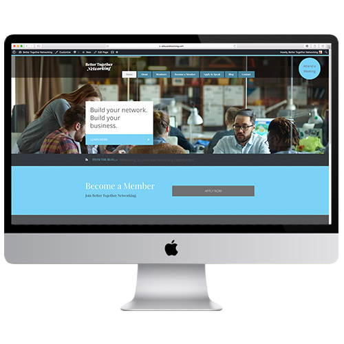
Mindy (Off-Center’s content writer and owner of her own web marketing business, Sincerely Me) and I created a website for networking group, Better Together Networking (BTN). This was the first website ever for the group. The only place online that the group could be found previously was Facebook. So, our group’s online presence was limited.
Below is an accounting of the process we used to create and implement our strategy for the website.
It Started with Research
We started as we always do—with research. We made sure we understood the group’s goals, target audience, and the online behavior of that target audience. We determined what we needed the website to do. To build a site to set BTN apart, we took a look at trends for similar groups in the area.
Looking at the existing audience for BTN, we knew we were looking for more people with similar online habits and behavior, preferences and interests.
Design Strategy Needs
Then, Mindy began writing content. She worked on creating a brand message that would become the theme for the site. This is the message that we want the user to walk away with—the overall impression. The words of this message must be supported by the design for both the words and design to be effective.
While she worked on the content supporting that brand message, I focused on the bones of the site and a strategy for the organization of information that would be ideal for the target audience.
We worked together to interweave content and design to make the most impact on the user. I kept the navigation simple and straightforward to streamline the user experience, and we incorporated clear calls to action that encouraged them to learn more, explore the site, and ultimately—visit BTN’s networking meetings.
The content and design strategy for the site needed to account for a number of needs:
- BTN needed to further brand itself and to create a clear message, outlining its ideal audience’s wants, any obstacles to those wants, and how BTN would help them overcome the obstacles.
- BTN’s site also needed to engage the ideal audience so professionals were drawn in and eager to visit.
- The group wanted to convey what made them different.
- And ultimately, the group wants to grow its membership.
As for functionality needs, the needs were simple—a form for speakers to apply, an online membership application, and a general inquiry form for contact.
How do you create a design with all of these needs in mind? We start by breaking down what will help the website owner with each of their needs. What’s going to keep their message clear and further their brand? What’s going to entice users to engage, stick around, and hopefully attend a meeting? How do we make it clear what makes them different?
Website User Behavior
Have you ever been to a website that you had to really dig through to get to the point or the important information? Have you ever gone to a site that was so confusing because of the navigation that you eventually gave up? Or a site that said one thing but appeared to be something else entirely?
That’s exactly what we want to avoid with every site we build. In this instance specifically, the goal was to build something that started with a connection and the most important information up front, making a great instant impression with the supporting design. That was the strategy for the site because it would fulfill all of BTN’s needs for a website.
Implementing the Strategy
From the hero image at the top of the homepage to the upcoming events listed in the footer to the calls to action in between, I designed with clarity and user behavior in mind. Knowing that the target audience for BTN is busy professionals, I focused on giving them easy access to the information they will want up front so they won’t have to dig through the site. That meant planning the space carefully. I integrated the connection-inducing elements with the important information to maximize the impact for the amount of time a typical user would be on the site.
Mindy’s content also focused on the same elements. She clearly outlined the benefit of attending BTN’s networking meetings, focusing on connecting with the user on the homepage and directing them to other areas on the site to continue learning. She built on those principles, adding more information to support the benefits and add to that connection throughout the rest of the site. We reiterated the theme on every page with content and design.
Her words and my design work together to make the point, make the connection, and urge the user to navigate the site in a specific order.
Utilizing design psychology, I designed the site in a specific way to draw the eye and encourage its movement in an order that will allow the user to effortlessly understand what the site is about and where to look next. Making the navigation of the site intuitive is the ultimate goal for user experience and one that I take very seriously with every project. This is why design psychology is something I am always reading about and expanding my knowledge because it is so important to creating the best possible user experience.
Launch Day
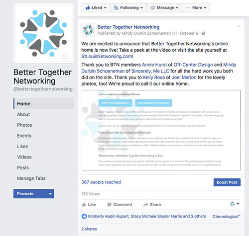
We officially launched the website on October 5, 2016. We posted a video preview of the site on Better Together Networking’s Facebook Page that has been viewed 170 times since it was posted. The post on Facebook announcing the launch was shared twice, and it reached 367 people.
I posted to Off-Center’s Facebook Page, showing another website completed by OCD. The post reached 83 people. Mindy posted to Sincerely Me’s Facebook Page as well, reaching 76 people.
The Results
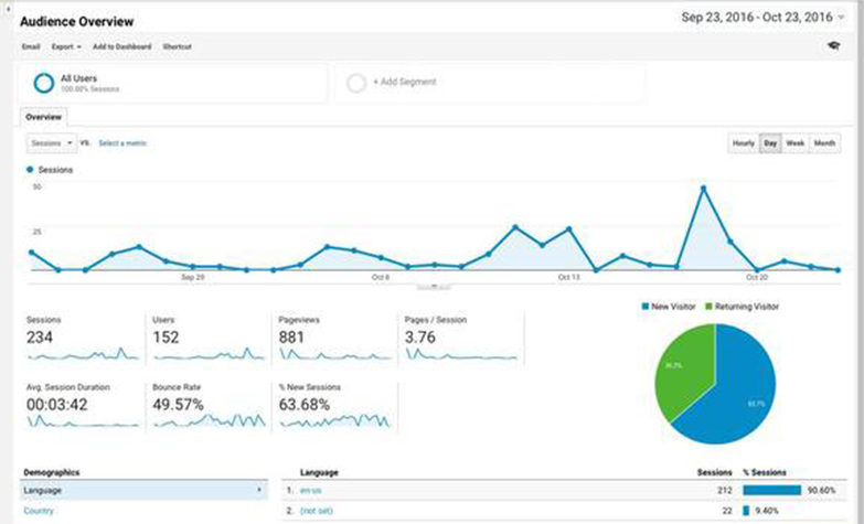
On October 23 (18 days after launch), we took a look at the analytics for the site. We discovered that:
- The site had 881 page views,
- 234 sessions (a session is defined as the entire event of one user navigating the website).
- The average number of pages viewed was 3.76 (so, the users on the site took a look at 3+ pages on average).
- The amount of time on average each user spent on the site was 3 minutes and 42 seconds (in a world where over half of users typically only browse a site for an average of 15 seconds, this number alone is a huge success).
So, what do all of these numbers mean?
These numbers translated directly to a 27% increase in member inquiries, a 100% increase in general inquiry, and exposure to a previously unreached crowd. The site added a sense of permanence and professionalism to Better Together Networking, setting the group apart from many other groups in the area. The group reached a new segment of the group’s target audience. And we achieved this in 18 days of the site’s launch with minimal effort to promote the new site.
How did the minimal promotional effort still translate to 234 sessions and over 800 page views?
The Website is Performing Exactly as Designed
We are organically reaching the right people, and those people are responding. The design exudes professionalism. The site conveys the message it needs to convey. It impresses. It converts.
If you’d like to receive information about the latest design trends, helpful tips on branding and marketing, and more from Off-Center Design, sign up below.


 I know you’re tired of being the world’s best-kept secret. Shoot, you’re just tired in general.
 When your website is already kicking butt, the best way to convert browsers into buyers is with a sales funnel.